Net Benefit and Decision Curve Analysis in R - Some helpful functions
Background
One of the challenges of developing clinical prediction models is deciding which one is best. Sometimes traditional performance measures such as the Brier score or C-statistic might be used to quantify to what extent one model performs better than another. But in the realm of clinical medicine, a model’s predictive performance, whether measured by discrimination, calibration, or something else, doesn’t guarantee clinical benefit. When it comes to patients, that is usually the most important thing.
The clinical benefit of a prediction model, however, is not straightforward to measure. How well does the model perform for an individual patient? How might delivery of the predictive information to different stakeholders influence (or not) their decision making? Does the model perform better for some groups of patients compared to others? How do individual stakeholders value different aspects of the prediction model, including different errors? How are the costs and benefits accounted for?
If one wanted to answer these questions, undertaking a discrete choice experiment, an ethnographic study with qualitative interviews of all stakeholders, a human factors development and design process, and a randomized clinical trial, could help. But these studies are complex, time consuming, and costly. Is there a faster way to compare the clinical benefit of a group of prediction models?
Decision curve analysis and net benefit
In 2006, Vickers and Elkin introduced the idea of Decision Curve Analysis, an approach to estimate the net benefit of a prediction model using only the data available from the model itself. That is, using only the predicted probabilities of a model along with the observed outcomes, and relying on the assumption that a decision threshold is chosen to represent the relative importance of sensitivity and specificity (or false positive and false negative predictions), the authors describe how to calculate the net benefit of a model.
In plain language, the net benefit is the proportion of people rightly treated less the proportion wrongly treated, weighted by the decision threshold to choose treatment or not.
For a helpful discussion on interpreting decision curves see Vickers, van Calster, and Steyerberg (2019).
In the original paper, the net benefit is calculated as:
\[ \frac{TP_c}{N} - \frac{FP_c}{N} \left(\frac{p_t}{1 - p_t}\right) \]
where \(TP_c\) and \(FP_c\) are the true- and false-positive counts, respectively, \(N\) is the number of observations, and \(p_t\) is the probability threshold.
An implementation in R
Here is an implementation of the net benefit calculation that is implemented in the gmish package:
nb <- function(preds, obs, p_t, weight = 1) {
  weight * tpc(preds, obs, thresh = p_t) / length(preds) - fpc(preds, obs, thresh = p_t) / length(preds) * p_t / (1 - p_t)
}
The tpc and fpc functions provide the true- and false-positive counts at the threshold p_t. This function also allows further weighting but we’ll save that for a later discussion. The default weight = 1 reduces to the original equation described above. To calculate the net benefit over the full range of thresholds and plot a decision curve, here is another function also implemented in the same packae:
nb_plot <- function(form, data, treat_all = TRUE, treat_none = TRUE, omniscient = TRUE, weight = 1, max_neg = 0.1) {

  data <- as.data.table(data)
  # Identify vars
  .y <- all.vars(form)[1]
  .mods <- all.vars(form)[-1]

  dt_list <- lapply(.mods, function(m) {
    data.table(p_t = seq(0,0.99,.01))[,
                                                               .(Model = m,
                                                                 net_benefit = nb(data[,get(m)],
                                                                                       data[,get(.y)],
                                                                                       p_t = p_t,
                                                                                       weight = weight)),
                                                               by = p_t]
  })

  if (treat_all) {
    treat_all_dt <- data.table(p_t = seq(0,0.99,.01))[,
                                      .(Model = 'Treat all',
                                        net_benefit = nb(rep(1, nrow(data)), # guess 1 for everyone
                                                         data[,get(.y)],
                                                         p_t = p_t,
                                                         weight = weight)),
                                      by = p_t]
    dt_list <- append(dt_list, list(treat_all_dt))
  }

  if (treat_none) {
    treat_none_dt <- data.table(Model = 'Treat none', p_t = seq(0,0.99,.01), net_benefit = 0)
    dt_list <- append(dt_list, list(treat_none_dt))
  }

  if (omniscient) {
    omniscient_dt <- data.table(p_t = seq(0,0.99,.01))[,
                                                      .(Model = 'Treat omnisciently',
                                                        net_benefit = nb(data[,get(.y)],
                                                                         data[,get(.y)],
                                                                         p_t = p_t,
                                                                         weight = weight)),
                                                      by = p_t]
    dt_list <- append(dt_list, list(omniscient_dt))
  }

  dt_all <- rbindlist(dt_list, use.names = TRUE)

  ymax <- max(dt_all$net_benefit, na.rm = TRUE)

  p <- ggplot(dt_all, aes(p_t, net_benefit, color = Model)) +
    geom_line(size = 0.3) +
    xlim(0, 1) + ylim(-1 * max_neg * ymax, ymax * 1.05) +
    xlab('Threshold probability') + ylab('Net benefit') +
    theme_bw() +
    coord_fixed()

  return(p)
}
This function accepts a formula form to indicate the outcome variable and then several models to compare simultaneously. Additional decision curves can be added to the plot for treat_all, treat_none, and omniscient treatment strategies. This calculation is really the benefit accrued to those treated and so the benefit of treating none is by definition zero (and so does not account for the potential costs of a false negative error, i.e. failing to treat someone who could have benefited from treatment).
Example (A completely invented case study)
Let’s say we have a bunch of penguins from the palmerpenguins dataset all hanging out together. Sadly, the water has been contaminated on the island of Biscoe and all of penguins from that island need an urgent antidote to prevent them from falling ill. However, the local ecologist doesn’t know which island the penguins came from and instead can only measure their bills, flippers, body mass, and sex. Let’s build some classification models to help the ecologist find penguins who need treatment.
# Load libraries and data
library(gmish) # remotes::install_github('gweissman/gmish') if not installed already
library(data.table)
library(ggplot2)
library(palmerpenguins)
library(ranger)
library(ggsci)

# Use complete cases for the example
pp <- penguins[complete.cases(penguins),]

# Take a look at the data

ggplot(pp, aes(bill_length_mm, flipper_length_mm, size = body_mass_g, color = sex)) +
  geom_point() +
  facet_grid(~island) +
  theme_bw() +
  scale_color_aaas()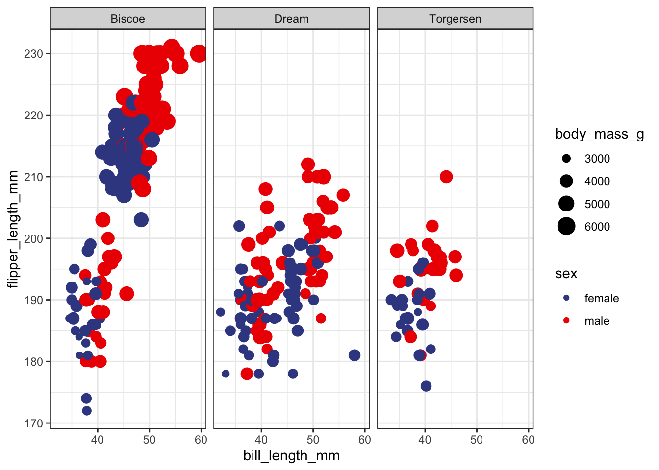
# Build a model
model1 <- glm(island == 'Biscoe' ~ bill_length_mm + flipper_length_mm + body_mass_g + sex,
              family = binomial, data = pp)
summary(model1)
##
## Call:
## glm(formula = island == "Biscoe" ~ bill_length_mm + flipper_length_mm +
## body_mass_g + sex, family = binomial, data = pp)
##
## Deviance Residuals:
## Min 1Q Median 3Q Max
## -1.7141 -0.6526 -0.1626 0.3955 2.4611
##
## Coefficients:
## Estimate Std. Error z value Pr(>|z|)
## (Intercept) -1.417e+01 3.380e+00 -4.192 2.77e-05 ***
## bill_length_mm -1.620e-01 4.267e-02 -3.796 0.000147 ***
## flipper_length_mm 5.012e-02 2.562e-02 1.956 0.050416 .
## body_mass_g 2.897e-03 5.061e-04 5.725 1.04e-08 ***
## sexmale -1.692e+00 4.020e-01 -4.208 2.57e-05 ***
## ---
## Signif. codes: 0 '***' 0.001 '**' 0.01 '*' 0.05 '.' 0.1 ' ' 1
##
## (Dispersion parameter for binomial family taken to be 1)
##
## Null deviance: 461.49 on 332 degrees of freedom
## Residual deviance: 254.21 on 328 degrees of freedom
## AIC: 264.21
##
## Number of Fisher Scoring iterations: 5preds_model1 <- predict(model1, type = 'response')
# How well does it perform?
make_perf_df(preds_model1, pp$island == 'Biscoe')## metric estimate ci_lo ci_hi
## 1 brier 0.11931004 0.09459123 0.1414849
## 2 sbrier 0.52254884 0.44031013 0.6204561
## 3 ici 0.08269116 0.04607298 0.1093371
## 4 lloss 0.38170012 0.31786040 0.4392324
## 5 cstat 0.88448214 0.84624249 0.9213535# Build a second model
model2 <- ranger(island == 'Biscoe' ~ bill_length_mm + flipper_length_mm + body_mass_g + sex,
data = pp, probability = TRUE)
print(model2)## Ranger result
##
## Call:
## ranger(island == "Biscoe" ~ bill_length_mm + flipper_length_mm + body_mass_g + sex, data = pp, probability = TRUE)
##
## Type: Probability estimation
## Number of trees: 500
## Sample size: 333
## Number of independent variables: 4
## Mtry: 2
## Target node size: 10
## Variable importance mode: none
## Splitrule: gini
## OOB prediction error (Brier s.): 0.1107188preds_model2 <- predict(model2, data = pp)$predictions[,2]
make_perf_df(preds_model2, pp$island == 'Biscoe')## metric estimate ci_lo ci_hi
## 1 brier 0.04343418 0.03476987 0.05138225
## 2 sbrier 0.82618645 0.79477513 0.86025131
## 3 ici 0.09017145 0.07128279 0.10680068
## 4 lloss 0.16303220 0.14019543 0.18625625
## 5 cstat 0.99862865 0.99736560 1.00072050# Summary predictions
results_dt <- data.table(sick_island = pp$island == 'Biscoe',
glm = preds_model1,
rf = preds_model2)
# Look at model precision and recall
pr_plot(sick_island ~ glm + rf, data = results_dt)## Warning: Removed 2 rows containing missing values (`geom_point()`).## Warning: Removed 2 rows containing missing values (`geom_line()`).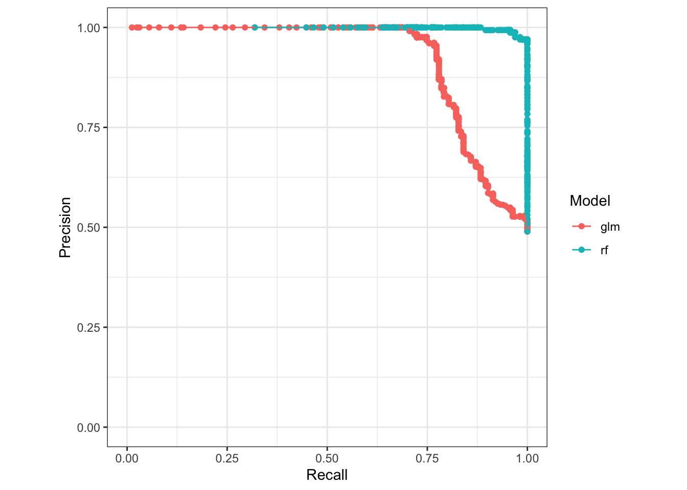
# Look at model calibration
calib_plot(sick_island ~ glm + rf, data = results_dt, cuts = 5, rug = TRUE)
## Warning: Removed 4 rows containing missing values (`geom_bar()`).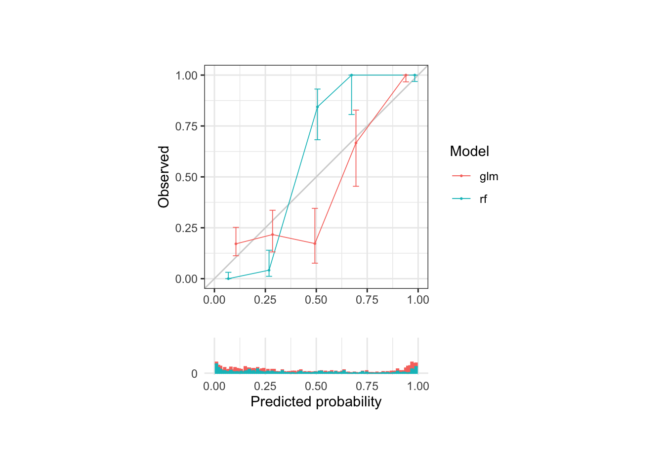
So we have a general sense of the models’ performance, which seems pretty good overall. The fact that they are all likely very overfit in this example is important to mention but we’ll deal with that in a later conversation. Now, we’re stuck with the question, which model should we use to pick out the penguins for treatment? The regression model or the random forest model?
The intended use case for decision curves is to identify the optimal model given a choice of threshold. In this case, let’s say that the medication does have some but not terrible side effects, so we prefer a decision threshold around 30%. Which model provides the most benefit in this range?
# For simplicity, just plot the net benefit of the two models trained above
nb_plot(sick_island ~ glm + rf, data = results_dt,
        treat_all = FALSE, treat_none = FALSE, omniscient = FALSE)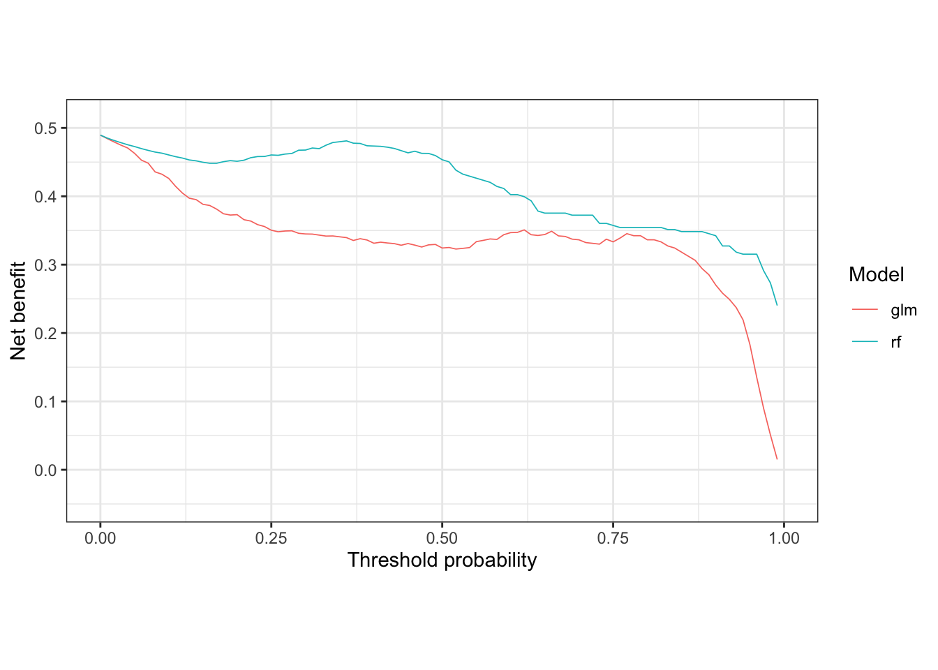
Clearly in the 30% threshold range, the random forest model provides more benefit to those treated. Now let’s compare these models against treat all, treat none, and treat omnisciently strategies.
nb_plot(sick_island ~ glm + rf, data = results_dt,
        treat_all = TRUE, treat_none = TRUE, omniscient = TRUE)
## Warning: Removed 48 rows containing missing values (`geom_line()`).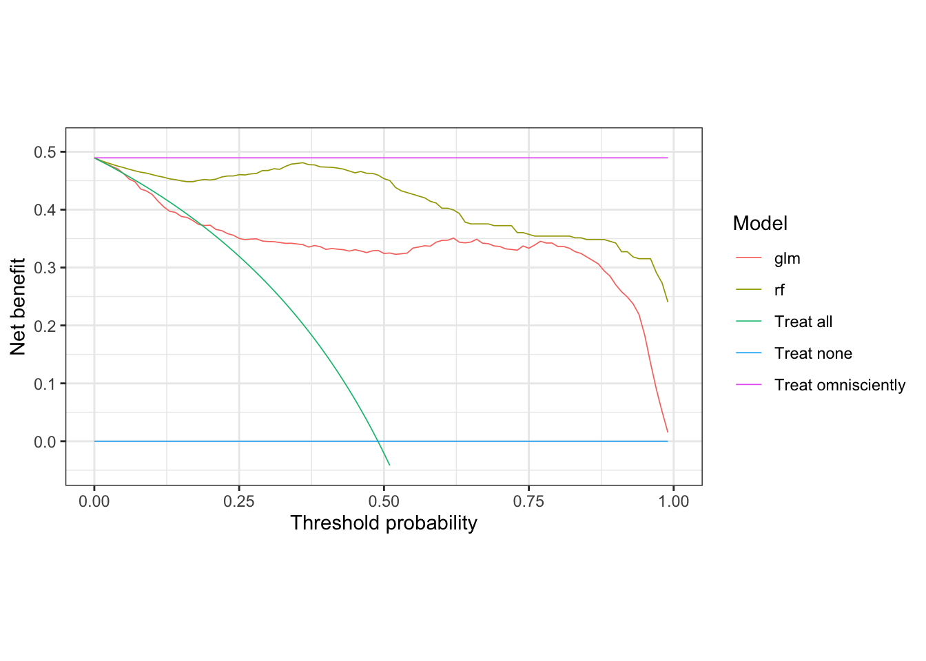
The treat none strategy, by definition, provides zero net benefit, so represents a lower bound of what the other models should provide if they are useful. The treat omnisciently strategy represents the upper bound on what any model could provide. In this case, the treat all strategy does a little better than the glm model in the 10 to 20% threshold range, but otherwise provides less net benefit than both the glm and rf across the rest of the range.
Let’s again highlight the range of interest that we determined ahead of time based on our choice of threshold which here determines the relative weighting of true and false positives. However, if you asked the penguins, they might choose a different threshold!
Since we chose 30% as our decision threshold, let’s examine the neighborhood around 30% looking at 5% in either direction.
nb_plot(sick_island ~ glm + rf, data = results_dt,
        treat_all = TRUE, treat_none = TRUE, omniscient = TRUE) &
  geom_rect(xmin = 0.25, xmax = 0.35, ymin = -Inf, ymax = Inf,
            fill = 'orange', color = 'orange', alpha = 0.01, inherit.aes = FALSE)
## Warning: Removed 48 rows containing missing values (`geom_line()`).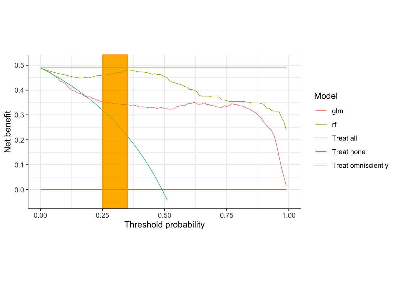
In this range of interest, the random forest model provides the highest net benefit. Let’s go save some penguins!
Assistant Professor of Medicine and Informatics
I am a pulmonary and critical care physician at the University of Pennsylvania Perelman School of Medicine, and core faculty member at the Palliative and Advanced Illness Research (PAIR) Center. My work seeks to translate innovations in artificial intelligence methods into bedside clinical decision support systems that alleviate uncertainty in critical clinical decisions. My research interests include clinical informatics, artificial intelligence, natural language processing, machine learning, population health, and pragmatic trials.