Grey’s Anatomy Network of Sexual Relations
Here’s the blog post originally posted on babelgraph.org on March 25, 2011. The relevant hyperlinks and igraph code have been updated to reflect the current state of things. The edgelist, despite many more intervening seasons, and thus many more romances, has not been updated. Here is a nice walkthrough of ERGMs based on this post – sorry for the broken link, Ben.
This all began with an introductory presentation about social network analysis to a group of medical students. What better way to grab their attention than with attractive, fake doctors having sex on television? Naturally this led to the dense network of sexual contacts between characters on the Grey’s Anatomy television show. After viewing many hours of previous episodes and exploring fan pages (especially here for an early attempt at a graph representation of sexual contacts), I was able to come up with an extensive but by no means exhaustive list of contacts. The edge list is available here.
This example uses the igraph package for R, both free to download. First we create the graph, give it a layout, and plot.
library(igraph)
ga.data <- read.csv('ga_edgelist.csv', header = TRUE)
g <- graph.data.frame(ga.data, directed=FALSE)
summary(g)
g$layout <- layout.fruchterman.reingold(g)
plot(g)
Without knowing who is represented by each vertex, what can you deduce from the graph? From a public health perspective, if you could test one person for sexually transmitted infections (STIs), who would it be? If you could provide counseling and a free box of condoms to one person, who would it be? If you knew that an epidemic was spreading through this network, who would you want to be to best avoid it?
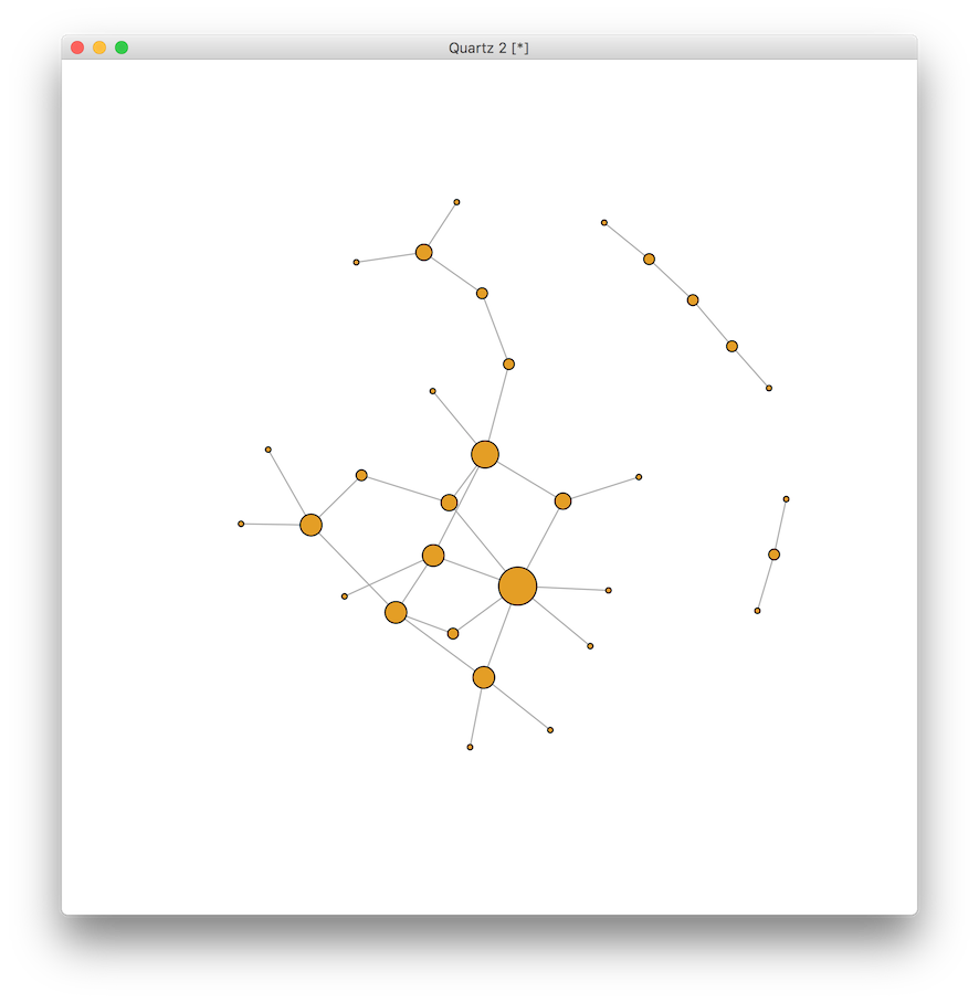
Now let’s make the visualization a little more interesting. First we can remove the labels for now, and then change the size of the vertex to represent the degree, or degree centrality, corresponding to the number of partners of each vertex. In the context of transmissible infections, this would indicate the number of people a person could infect or be infected by through sexual contact.
V(g)$label <- NA # remove labels for now
V(g)$size <- degree(g) * 2 # multiply by 2 for scale
plot(g)
This tells us about the absolute number of partners, but not much about the relative position within the network. Let’s examine two types of centrality: closeness and betweenness. The closeness centrality is the average shortest path from one vertex to every other on the graph. A high number indicates that a vertex is quickly reachable by the majority of vertices in the graph, while a low number indicates that the vertex is far from most other vertices on the graph. We can calculate the centrality and then rescale the values to create a color scheme to visualize the relative differences.
clo <- closeness(g)
# rescale values to match the elements of a color vector
clo.score <- round( (clo - min(clo)) * length(clo) / max(clo) ) + 1
# create color vector, use rev to make red "hot"
clo.colors <- rev(heat.colors(max(clo.score)))
V(g)$color <- clo.colors[ clo.score ]
plot(g)
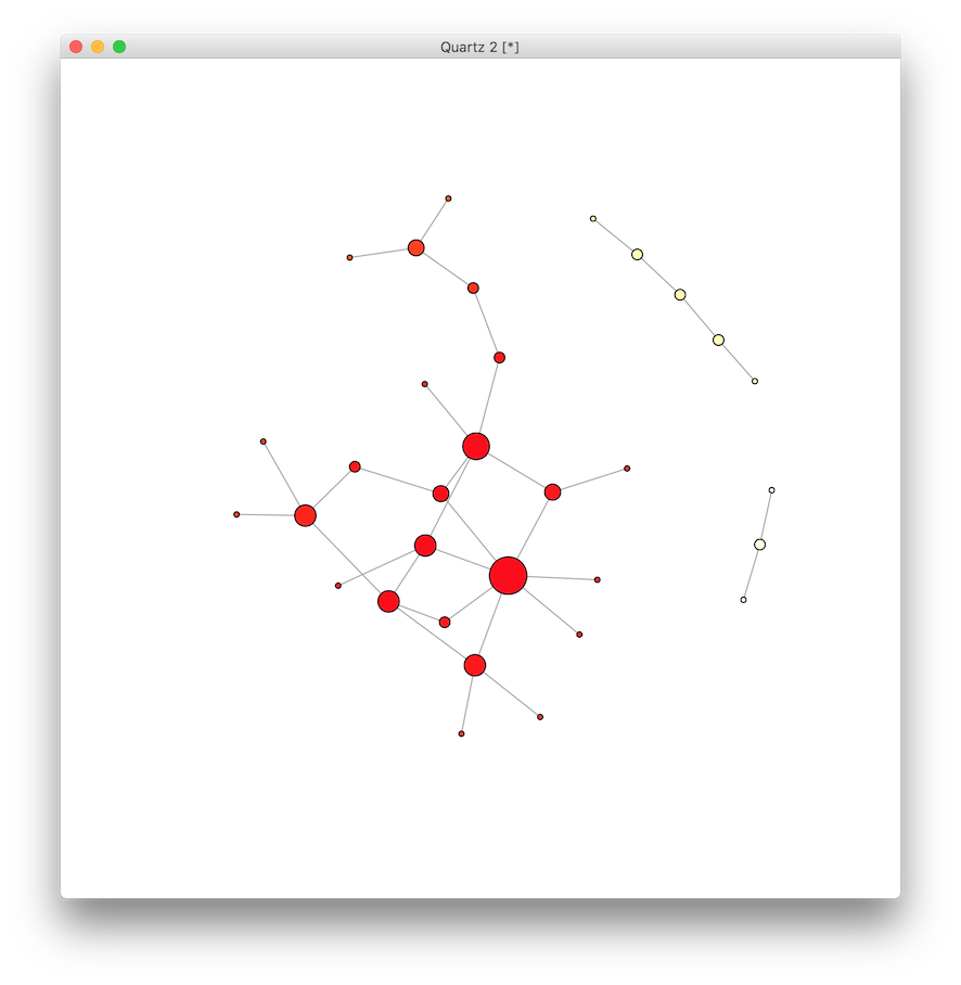
It appears there are a few vertices on the red “hot” end of the spectrum, and a few at the “cold” end. Next we do the same for each vertex to calculate the betweenness centrality, which is the number of shortest paths on the network that pass through the vertex. Vertices with high betweenness centrality might be thought of as serving a gatekeeper role in mediating the shortest connections between other vertices.
btw <- betweenness(g)
btw.score <- round(btw) + 1
btw.colors <- rev(heat.colors(max(btw.score)))
V(g)$color <- btw.colors[ btw.score ]
plot(g)
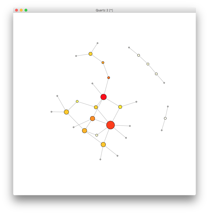
This last graph of betweenness indicates slightly more variation among the likely suspects, while the analysis of closeness centrality demonstrated less variation. Why?
A useful technique in social network analysis is the use of community finding algorithms. Here we use the implementation of the Girvan-Newman algorithm (paper here) to detect the underlying community structure of the graph. We will iterate through each merge to determine which cut produces the maximum modularity, and then use that number to calculate the groups.
# this section has been substantially revised to reflect the
# newer version of igraph which does GN membership easily
V(g)$color <- membership(cluster_edge_betweenness(g))
V(g)$size <- 15 # reset to default size
plot(g) # those new default igraph colors are so much nicer, too!
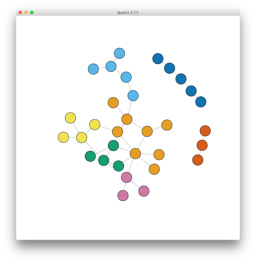
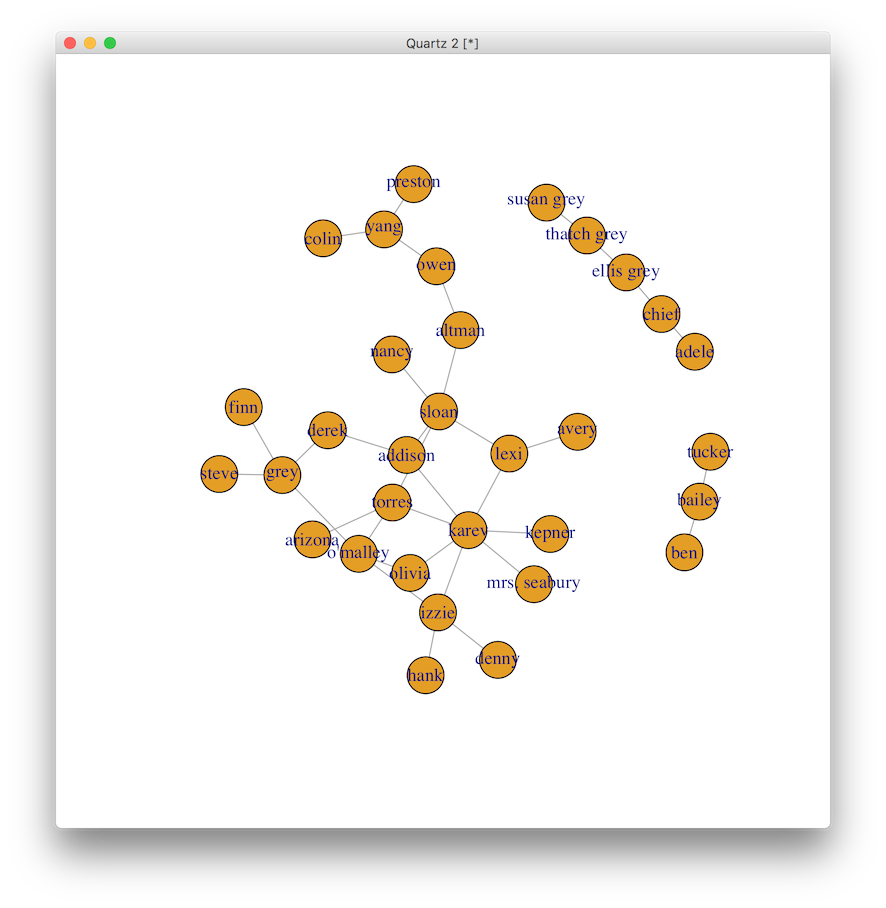
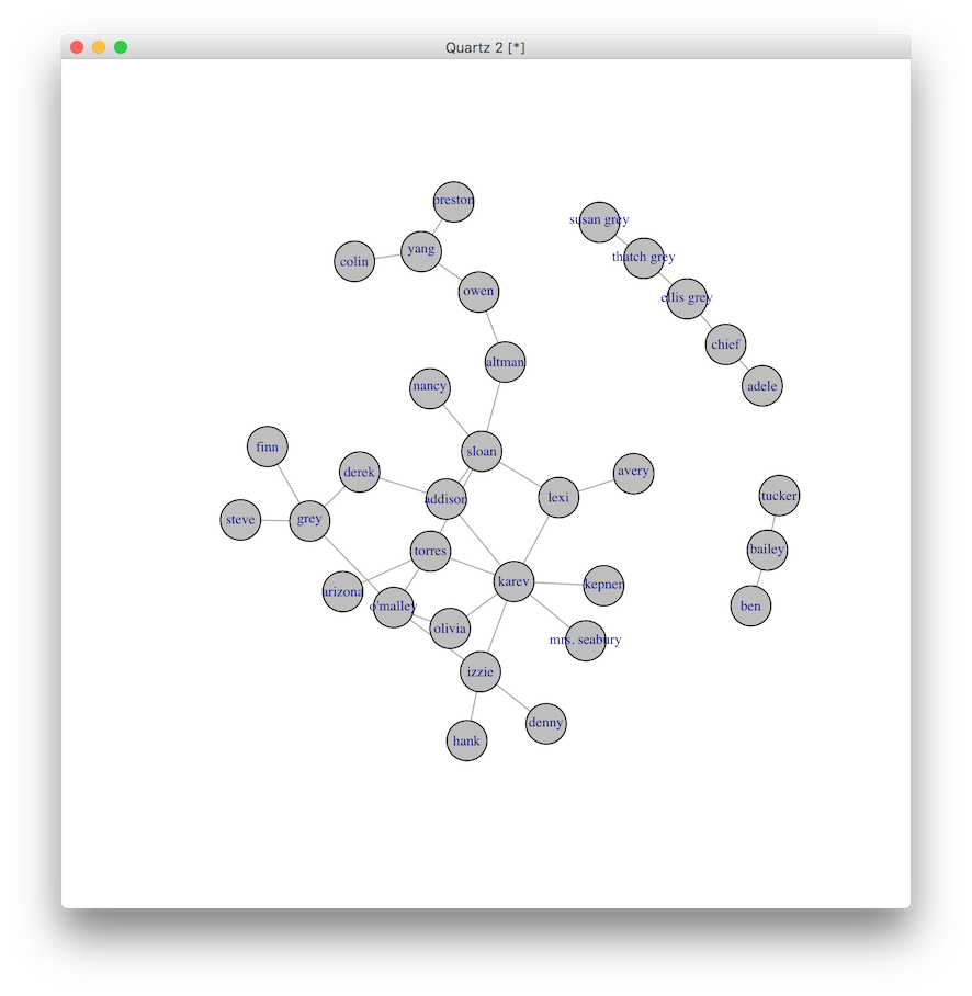
Once you see the graph with names, it is interesting to note the breaks in connectivity around race and age (I guess you have to know the TV characters to appreciate this ;) ) So before seeing the names, back to the original question. Who would you test? Who would you counsel? Who would you vaccinate? Who would you rather be?
And the winners are…
V(g)$color <- 'grey'
V(g)$label <- V(g)$name
V(g)$label.cex <- 0.7 # rescale the text size of the label
plot(g)
Assistant Professor of Medicine and Informatics
I am a pulmonary and critical care physician at the University of Pennsylvania Perelman School of Medicine, and core faculty member at the Palliative and Advanced Illness Research (PAIR) Center. My work seeks to translate innovations in artificial intelligence methods into bedside clinical decision support systems that alleviate uncertainty in critical clinical decisions. My research interests include clinical informatics, artificial intelligence, natural language processing, machine learning, population health, and pragmatic trials.